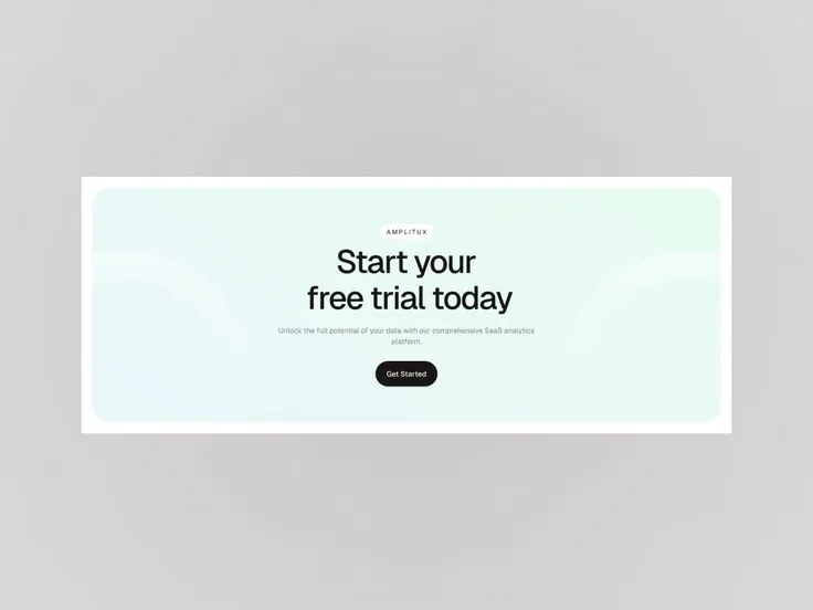
The ultimate goal when producing content is always Conversion. Throughout the journey from attracting attention (Attention) to creating interest (Interest) and finally desire (Desire), Call-to-Action (CTA) is the powerful "green light" to motivate customers to take action, moving from "potential" status to "real customer".
CTA is not just a part of the article; it is the final bridge, a key tool in marketing to link brand values with specific actions. However, designing an effective CTA is often overlooked, leading to a series of basic mistakes that cause huge losses in revenue.
Below is an in-depth analysis of the 20 most common mistakes when writing and designing CTAs, classified by strategy, language, and user experience (UX/UI) groups, along with optimal solutions.
I. STRATEGIC ERRORS AND EXPECTATIONS
This group of errors involves inconsistency between the promise in the CTA and the actual value customers receive, causing distrust and "betrayal" of customers right from the first step.
1. CTA "Hanging a Goat's Head to Sell Dog Meat"
Normally, businesses mechanically use a fixed CTA or change it very little without paying attention to whether it conveys the core value of the content being presented or not.
In-depth analysis: This error occurs when there is a difference between Content Commitment and Requested Action (Action Request). For example: The article talks about "Marketing secrets in 2024" but the CTA calls for "Follow Fanpage to see behind-the-scenes photos of the company". This creates a "Value Gap".
Solution: Keep what you promise! The CTA should be the next logical step of the content. If the content is educational, the CTA should lead to another free resource (e.g., Ebook, Template), not an unrelated entertainment activity.
2. CTA Language Is Inconsistent with the Landing Page
This is a more serious error than the "hanging on the goat's head" error, because it makes customers feel "betrayed" when they trusted them to click.
In-depth analysis: This error often occurs when the CTA on the ad (or article) promises to "Download free documents immediately" (implying a simple action), but when they reach the landing page, the customer You have to fill out a complicated form (Name, Email, Phone Number, Position) and join another group to receive the documents. Customers feel the process is too complicated compared to the original "promise".
Solution: Ensure Semantic Consistency. If the CTA is "Get Ebook Now", the landing page should only ask for Email (lowest cost to get value). If you need more information, install a secondary CTA after the customer has received the first value (For example: "Join Group Zalo to receive more updates").
3. Placing a CTA That Doesn't Match the Customer Journey
Using the same CTA for every stage of the Marketing Funnel is a big strategic mistake.
In-depth analysis: Customers in the Awareness stage are looking for general information, they need CTAs like "Read more" or "Download research report". Customers in the Consideration stage need CTAs like "Compare features" or "Sign up for a free trial". Including the CTA "Buy Now - 50% Off" for an article about a basic concept is premature and blatant.
Solution: Apply the CTA according to the TOFU-MOFU-BOFU (Top-Middle-Bottom of Funnel) Model. The CTA should reflect the reader's readiness to purchase. Analyze content to determine where customers are in the journey and choose the right CTA.
4. Forget to Place CTAs When Implementing Single Marketing Activities
CTA's aren't just for blog posts or landing pages. They need to be integrated into every touchpoint (Touchpoints).
In-depth analysis: Many businesses forget to integrate CTAs into other valuable and long-lasting assets:
About Us Page
- formula (CTA at the end of the video calling for the next action).
Solution: Perform a Brand Touchpoint Audit to ensure each customer interaction has a clear CTA, even if it is just a secondary CTA.
5. Overusing CTAs (CTA Overload)
Just like asking for a 5-star review before the trip begins, placing too many useless CTAs will be offensive.
In-depth analysis: Overusing CTAs not only confuses readers but also dilutes Page Authority and Link Equity (especially in SEO). When a page has 10 different CTAs, the Click-Through Strength will be broken down.
Solution: Use Primary CTA and Secondary CTA.
There should only be one Primary CTA (most important action) on each page.
Secondary CTAs (eg: share, subscribe to news) should be designed more delicately, not competing with Primary CTAs in color or position.
II. GROUP OF LANGUAGE ERRORS AND LACK OF VALUE
CTA is more than just a verb; it is a condensation of benefits. Errors in this group reduce the persuasiveness and urgency of the appeal.
6. Customer-Unfriendly Language (Using Jargon)
Using jargon or insider language (Jargon) in CTAs creates a cognitive barrier.
In-depth analysis: CTAs need to be written in the language the target customer uses every day. If you market software to small business owners, don't use complicated "IT" or "Blockchain" language in your CTA. Complicated language creates a feeling of distance and lack of relevance.
Solution: Instead of focusing on Features, focus on Benefits. For example: Instead of "Sign up to try our AI-powered CRM Platform" (too much jargon), say "Start Increasing Customer Retention by 30% Today".
7. Failure to Convey Clear Value (Lack of Benefits)
CTA fails when it only focuses on the user's action without clearly stating what they will receive.
In-depth analysis: CTAs like "Click here" or "Sign up now" are empty verbs. Customers don't click because of the action, they click because of the Value attached. If you don't make it clear what value your product/service brings to them, they won't take action.
Solution: The CTA must highlight the desired outcome.
Bad: "Click here to get a promo code."
Good: "Get a 30% Off Code to Get a Set Speed Optimization SEO Tool"(Value + Action + Specificity).
8. Too Long and Lacking Focus
Research shows that the ideal length for a CTA is 90-150 characters (including leading sentences). Lengthiness reduces urgency and memorability.
In-depth analysis: Long CTAs often try to explain too much about the process instead of focusing on the benefits. Readers tend to get distracted, and a CTA that's too long won't be strong enough to keep them engaged.
Solution: Remove irrelevant words. Use action-oriented language and focus on a single important goal.
Bad: "Please leave your email, because only by using email can we make a list and make sure you are not missed when you become the lucky winner of the prize..."
Good: "Sign up Email: Guaranteed 1 Year Free Software Opportunity!"
9. Don't Use Numbers and Specificity
Humans are attracted to numbers because they provide evidence, specificity, and make it easier to process information.
Depth analysis: Numbers help reduce ambiguity and increase authenticity and trustworthiness. Statistics, percentages, or specific times (timelines) create a stronger CTA.
Solution: Integrate social proof metrics (Social Proof) or direct benefits.
Bad: "There are thousands of other people who have participated in this humanitarian blood donation program."
Good: "More than 57,825 people have participated, will you be the next benefactor?"
Better: "Download 10 CTA Templates That Increase Click-through Rate by 45%."
10. Using Generic and Cliché Words
CTAs like "inbox now", "register now", "click here" have become saturated and lack appeal.
In-depth analysis: CTAs need to reflect the unique value of the product. An attractive CTA must cover the product/service with a strong appeal, making readers feel like they are missing out on something special.
Solution: Replace general words with words that evoke emotion, or are highly specialized (depending on context).
Poor: "Inbox now to receive advice."
Good (Course): "Discover the Ease of English for Your Career - Schedule a 1-session Experience."
Good (Spa): "Regenerate Youthful Skin That Lasts Decades After One Click."
III. DESIGN ERRORS (UX/UI) AND EXPERIENCE GROUP
CTA design must ensure visibility (Visibility) and ease of interaction (Usability), especially on mobile devices.
11. CTA Button Design That Doesn't Stand Out (Lack of Contrast)
A good CTA is a combination of "integrating but not dissolving".
In-depth analysis: CTA needs to stand out immediately. If the CTA color blends too well into the overall page design (e.g., using a complementary brand color), users may mistake it for a regular piece of text or image.
Solution: Use Contrast Color. If the overall color scheme of the page is blue and white, the CTA should be a complementary color, such as orange, red, or yellow (in soft/pastel tones) to stimulate the eye without being obtrusive.
12. CTAs Are Not Big Enough or Misplaced (Optimal Placement)
CTA placement directly affects conversion rates because it is related to customer convenience and willingness to take action.
In-depth analysis: Customers do not always remember everything they just read. The CTA should serve as an anchor and reminder. Placing the CTA only at the bottom of the page (before the footer) is a common mistake, especially with long content.
Solution: Make sure the CTA is placed in strategic locations:
Above the Fold (ATF): Right at the top of the page (after the title/short intro).
Mid-Content: Within the body paragraphs long, place the CTA after you've presented a major benefit or key solution.
Footer/Footer: Place the main CTA last to attract people who have read the entire content.
13. CTAs Are Not Mobile-Friendly
With over 70% of traffic coming from mobile devices, ignoring mobile optimization is a fatal mistake.
In-depth analysis: A CTA button may look great on desktop but be too small, too close to other elements (leading to wrong clicks), or obscured by the navigation bar on mobile. The minimum CTA button size needs to meet Touch Target standards (about 48×48 pixels) to ensure interactivity.
Solution: Responsive Design is required. The CTA button must be large enough, easy to touch, and have clear padding around it. A/B testing mobile CTA buttons can increase conversion rates by up to 62%.
14. Use Only One CTA for Long Content
Long content and complex customer journeys require multiple CTAs to serve different purposes.
In-depth analysis: If the article is 3000 words long, having only one CTA at the bottom of the page will miss the opportunity to convert readers who were convinced midway through the article. Furthermore, businesses often have many goals (increase followers, collect emails, consult services).
Solution: Use many CTAs but have a clear goal.
CTA at the top: "Download Template" (collect emails).
CTA in the middle: "Sign up for in-depth Webinar" (retain and nurture Lead nurturing).
CTA at the end: "Contact General Marketing Services consultant" (end-of-funnel conversion).
15. Using the Same CTA Button Repeatedly (Lack of Diversification)
Using the same call-to-action repeatedly in the same content (e.g., a "Sign Up Now" button 5 times) reduces effectiveness according to the Law of Diminishing Returns.
In-Depth Analysis: Each CTA in long-form content should change its language to fit the context of the most recent paragraph. Repetition does not create a sense of freshness or motivation to act.
Solution: Customize the Contextual CTA.
Under the paragraph about the competitor's problem: "Stop That Mistake! Download the Solution Check-list Now."
Under the paragraph about the solution: "Experience Breakthrough Technology This is Free."
IV. PSYCHOLOGICAL ERRORS AND CONVERSIONS
These errors involve creating psychological barriers or a lack of urgent motivation that causes customers to delay action.
16. "Blatant" Sales CTA (Lack of Psychological Leverage)
CTA selling too early without providing enough value is "pouring cold water" on the fire that has just been ignited.
In-depth analysis: Consumer buying psychology is to avoid the action of being "Being Sold". When CTAs are too focused on money and payment in the learning stage, it creates animosity.
Solution: Use psychological levers like "Free" (Free), "Learn" (Learn), "Discover" (Discover), and "Save" (Save) to reduce barriers. Only offer a payment CTA when the customer has reached the BOFU stage and received enough value from previous Lead Magnets.
17. CTA Does Not Create a Sense of Urgency
Humans tend to delay action (Procrastination Bias). Urgency is the most powerful stimulus for action.
In-depth analysis: A CTA with no time limit or quantity will be placed on the "Later" list by users. Phrases that create a sense of urgency (FOMO) like "Only Go."
Quantity: "Download - Only 100 Free Ebooks Left."
Content: "Tonight's Livestream Will Be Deleted As Soon As It Ends - Watch Now."
18. Non-Specific CTA (Lack of Instructions)
The CTA needs to do what it promises and navigate the user properly.
In-Depth Analysis: If the CTA promises "Try the product for free", the user should be directed to a trial page or an account creation page. If they are directed to an unrelated FAQ page, pricing page, or community group, the experience is interrupted and they will leave.
Solution: CTAs must have high Directionality. Check the Link Destination to make sure it 100% matches the CTA's promise.
19. CTAs Are Not SEO Optimized (Lack of Appropriate Keywords)
CTAs are part of the landing page content, and should be optimized to improve traffic and context.
In-Depth Analysis: While CTAs should not be keyword-stuffed, incorporating related keywords helps search engines better understand the purpose of the linked landing page, while also increasing organic traffic
Solution: Instead of "Click here to download", use "Download Marketing Trend Report 2024" - keyword "Marketing Trend Report 2024" helps optimize SEO for the document landing page.
20. Customers Cannot Remember All the Values (Forget to Recall)
For long content, CTAs must play the role of summarizing and reiterating the greatest benefits.
Deep analysis: When customers finish reading a complex article, they only retain a few key points. A CTA fails when it doesn't reiterate the biggest benefit they're about to receive.
Solution: Use the Value-Driven CTA structure: [Biggest benefit] + [Urgentness] + [Action verb].
Example: "Don't miss out on the OFF deal 50% off in just 3 hours! Order and Save Now."
V. BUILDING OPTIMAL CTAs: 5-C PRINCIPLES
To overcome the above 20 mistakes, Marketing experts need to follow 5 golden principles when designing and writing CTAs:
Context:Place the CTA in a position appropriate to the purchase journey (TOFU/MOFU/BOFU).
Clarity (Clarity): clear): Language must be easy to understand, not general, and not use internal jargon.
Contrast: Design must stand out (color, size) and be mobile-friendly (Mobile-Friendly).
Conciseness: Be concise, focus on the core action, eliminate words redundant.
Credibility:The CTA promise must be 100% consistent with the landing page.
VI. DIGITAL TONS AND CONVERSION OPTIMIZATION STRATEGY
In fact, CTA optimization is not just a matter of Copywriting or Design, but is also part of a comprehensive Conversion Rate Optimization (CRO) strategy. To achieve the highest conversion efficiency, businesses need a partner who can:
Customer Journey Analysis: Accurately identify Drop-off Points and Value Gaps in existing content and CTAs.
Implement In-depth A/B Testing: Not only test language, but also test position, color, and the context of the CTA on different devices.
Building an Optimal Digital Infrastructure: Ensure the landing page is designed with UX/UI standards and is 100% consistent with the promise of the CTA.
Tan Phat Digital offers in-depth CRO solutions that integrate data analytics and user experience design to transform your CTA buttons from boring mistakes into sales generators. We help you build and test CTAs based on real data, ensuring every click leads to a valuable conversion.
Let Tan Phat Digital help you patch the final conversion gap. Don't let your million-dollar content fail just because of an unprofessional CTA.
VII. FREQUENTLY ASKED QUESTIONS (FAQs) ABOUT CTA OPTIMIZATION
Q1: What is the ideal click-through rate (CTR) for a CTA?
A: The ideal CTR depends a lot on the placement of the CTA and the distribution channel.
Email Marketing: A main CTA in an email can achieve a CTR of 2% - 5%.
Blog Articles: CTAs in articles can reach from 1% - 3%.
Search Ads: Can be up to 5% - 10% depending on the industry.
However, what is more important than CTR is the Conversion Rate after Click (Conversion Rate after Click). A CTA with a low CTR but high conversions is still better than a CTA with a high CTR but low conversions.
Q2: Is it more effective to use a text CTA (Text CTA) or a button (Button CTA)?
A: Buttons (Button CTA) are almost always more effective because they provide a clearer visual cue for interactivity (Affordance). Buttons tend to stand out more, especially when contrasting colors are used. Text CTAs (Text CTAs, e.g. hyperlinks) are often used for secondary CTAs or internal links to keep the content clutter-free.
Q3: What is the impact of ineffective CTAs on SEO?
A: Ineffective CTAs can indirectly negatively affect SEO through metrics:
Pogo-sticking: If customers click on your page but the CTA is not clear, they will return to Google immediately. This behavior increases Bounce Rate and signals to Google that your page does not satisfy search intent (Search Intent).
Poor CTR: Unattractive CTA on Meta Description causes low CTR on SERP, reducing rankings over time.
Q4: Should you use Sticky CTA on mobile no?
A: Should, but be careful. Sticky CTAs (fixed buttons at the bottom of the screen) on mobile can increase conversion rates, especially for primary CTAs (e.g. "Buy Now" or "Contact Consulting"). However, it should not take up more than 10-15% of the screen area to avoid affecting the content reading experience.
Q5: How to apply A/B Testing for CTAs most effectively?
A: When performing A/B Testing, you should change each element one by one to see which element is making a difference:
Language Testing Language: Change from verb to benefit (Example: "Get Ebook" vs. "Learn Marketing Secrets").
Test Design: Change color (contrast) or size.
Test Position: Change position (ATF vs. mid-article).
Test Urgency grant: Add a time or quantity limit.
Share